Get a clear picture of how your loyalty program impacts your business. These dashboards help you spot what's working, what needs attention, and where to optimize.
Go to Analytics → Loyalty Performance to see these metrics.
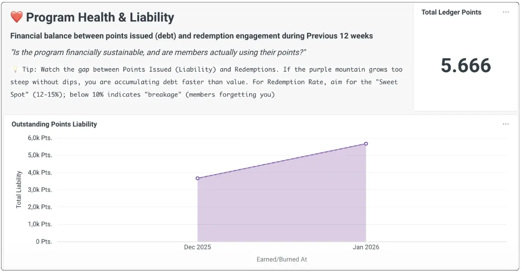
Program Health
Track the core health signals of your loyalty program.
Monthly Redemption Rate
The percentage of issued points that customers redeem for rewards within the same month.
- Target benchmark: 13%–15%
- Below 10% suggests customers aren't finding your rewards appealing enough
Outstanding Points Liability
The total "live" points held by all your customers. Think of this as your program's financial commitment — these points represent future discounts customers can redeem.
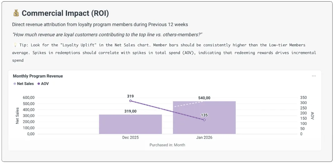
Commercial & Transactional Impact
Understand the revenue your loyalty program generates.
Monthly Program Revenue
Total revenue from loyalty members, pulled from your loyalty transaction history. Refunded transactions are automatically subtracted. All amounts are shown in your store's currency.
Average Order Value (AOV) Comparison
Compare spending between loyalty members and non-members. A higher AOV for members confirms your program is driving bigger orders.
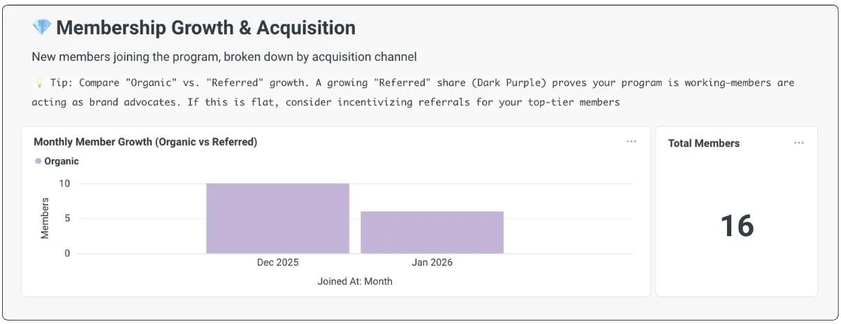
Membership Growth & Acquisition
Track how fast your member base grows and which channels drive sign-ups.
Monthly Member Growth (Organic vs. Referred)
See new members broken down by signup source — organic sign-ups vs. referrals.
- A rising Referred share (dark purple) means your members are actively recommending your brand
- If referral growth stays flat, consider increasing rewards for your top-tier members who refer friends
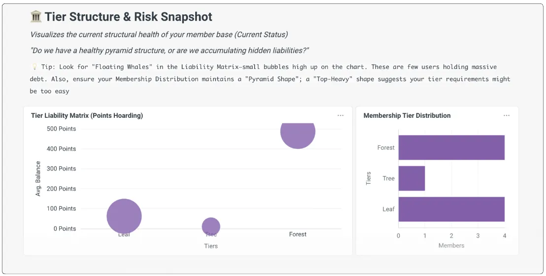
Tier Structure & Risk
Visualize the health of your member base across tiers and spot potential risks.
Tier Liability Matrix
Watch for "floating whales" — a small group of customers sitting on a large pile of unredeemed points. These represent concentrated financial risk.
Membership Tier Distribution
A healthy program looks like a pyramid: more members in entry tiers, fewer in VIP. If your distribution is "top-heavy," your tier requirements might be too easy, which can dilute your margins.
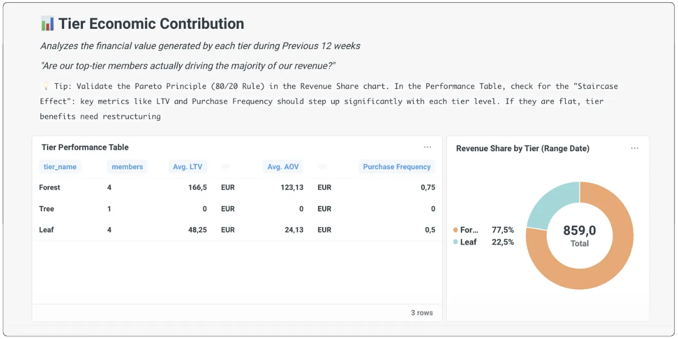
Tier Economic Contribution
Analyze the financial value each tier generates over a rolling 12-week window.
Revenue Share & the 80/20 Rule
Check whether your VIP tiers drive the majority of revenue. In a well-designed program, metrics like LTV (Lifetime Value) and Purchase Frequency should increase noticeably as customers move through tiers.